
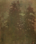
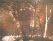
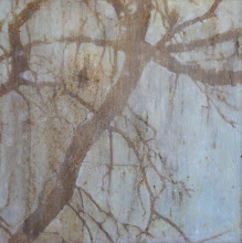
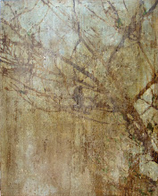
So here is what the original layout looked like. As you can see it was pretty much completely planned out before I started to put paint on the wall. Not included is the background pattern nor the colors, though we did work those out on full scale samples as well. All together well over 3 weeks worth of prep, for a mural that took three days to paint, and was up for a little less than a month before being painted over (what they usually do to showcase houses when they are done with the showcase).




4 comments:
oh my gosh, seriously? they painted over it!?
that is lame.
As a "reformed lurker" going through my 7 step program I would like to lay aside my former ways and leave a comment. I think I was actually mentioned indirectly in a previous post. The murals were spectacular, especially the one with the deer leaping out of a corner. It is a shame more art like that which I just saw couldn't transport us to a different place-art for art's sake. As a fan of fantasy, I am always fascinated with the idea of a portal which leads to the "other world". For instance, in Narnia of course it was the wardrobe. Harry Potter entered his train ride through a mysterious platform. I felt that the murals that I just saw were in a way a portal which could figuratively draw in the owner of the bedroom. Keep up the good work
One of my favorite murals so far. I think we've got to find a way to do wallpaper with it.
I really loved that. Awesome. When I get a house I don't care what I have to do, I'll pawn my antique family ring if I have to...I want a cool mural like that in my kids' rooms!
Post a Comment