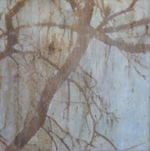
 This is a close up that shows the sheen. We put a little burnish on the plaster.
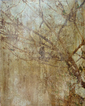
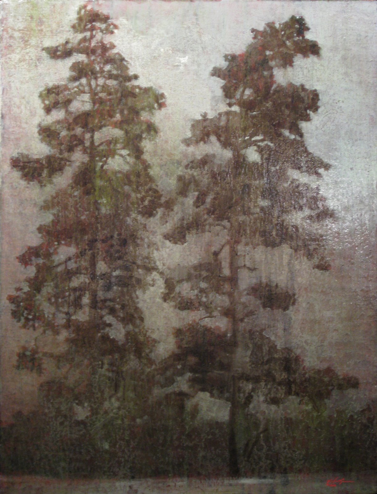
 the last image shows the patterning of the two colors, though the camera on my phone didn't like the light level much.
  I should be getting some images from one of my employees soon that show all this much better.




4 comments:
I actually like the colors for the setting... with all the icons and such. Really a fun project, I think.
I like how it turned out--don't see anything too strong about it...
Thanks again for the Dinosaur Park invite. Did you guys like it? I'm a wimp - it was just too cold for us and the novelty has sorta worn off since we go all the time. Maybe next time you come up this way we can all go to the Treehouse Museum together?
Is the last picture a "sunset" colors on a wall? Several colors of plaster? Where is that? Your ideas are always good, subtlety is not their strong suite. Its beautiful, as all your things better in person.
Post a Comment